logo
HALS Northern California Chapter
HOME | ABOUT US | FAQ | LANDSCAPES | MEETINGS | LINKS | GRANTS | CONTACT US


DOCUMENTATION

PHOTOGRAPHY TIP SHEET


Below are comments from an experienced HALS photographer (Brian Grogan) regarding photographs of Piedmont Way (HALS CA-2) taken by two beginning HALS photographers (Fredrica Drotos and Michael Kelly).

Overall, I believe the photographs made by Fredrica and Michael are very good, particularly so in light of their limited experience using a view camera.

Some of my comments are technical, some on documentation, some pertain to my way of seeing these projects and my personal visual aesthetic.

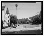
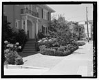
First observation is on camera management. Many of the photographs have a problem of converging vertical lines, i.e. buildings that look like they are not straight. No. 5 is a good example of the problem where the building on the left has a noticeable distortion.

This is simply a problem of the camera not being plumb and the film plane not being vertical to the scene. The camera is pointed up, creating an optical distortion. This is easily corrected using the movements of the view camera, using the rising front on the camera, rather than tilting the camera upwards.

As this occurs in several photographs I suspect the problem was simply from lack of experience. It is not always easy to see this on the ground glass of the camera. To ensure the camera is plumb vertically and horizontally I always use a small pocket level on the camera when I set it up to make sure it is level. Then I use the movements of the camera to frame the photograph.

Second observation is on camera placement. Again the photographs are generally very good so my comments are simply recommendations that could make the images a bit stronger visually and as documents.


No. 2

Click image to zoom
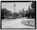
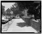
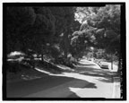
  A nice view. Very good document of the streetscape. Would recommend moving camera back a few feet to show more of the sidewalk on the left and all of the telephone pole on the right which will add more context to the scene.

The black marks on the photo beneath the guard rail on the left are clip marks from the film processing. If possible, try to find a lab that does not use machine processing for film in order to avoid these marks. GAMMA lab in San Francisco does 4x5 film by hand.

No. 4

Click image to zoom
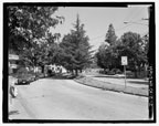
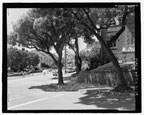
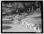
  Another nice, informative view. And the same recommendation -- a bit more space. Move the camera back -- and to the right -- to include where the pavement meets the wall in the left foreground. This will also include more of the street and curb. When moving the camera for one thing it is important to recognize how it will affect other parts of the image. If the camera is moved straight back, the two trees on the left will begin to merge and that bit of wall will be obscured. So the camera would need to go back and right to keep that wall in view.
No. 5 and 5x


Click image to zoom
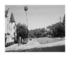
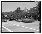
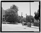
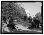
  As noted, the building on the left is a problem. This is corrected by leveling the camera. Compare to No. 5x to see a corrected view. The distorted building is no longer a distraction and the view is focused again on the streetscape. I like the placement of the words on the road. Good contextual information. Again I would recommend backing up a few feet to include more of the curb corner in the lower left and more of the road on the right side of the median.

I remember that Fredrica and Michael were using borrowed equipment. In many instances where I mention a slight move back they may have also benefited from having a slightly wider lens.

No. 9

Click image to zoom
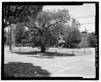
  Nice. A slight camera rotation to the right to include the chain post on the median at right edge of frame.
No. 14

Click image to zoom
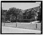
  Nice again. Good contextual view of architecture and streetscape. Again could use a bit more space -- moving back or using a 120mm lens instead of a 135mm lens -- I would like to see all of the bottom of the tree on the right so it shows the planting space and sidewalk. Also would be helpful to see the end of the median at the left rear for context and information.
No. 15

Click image to zoom
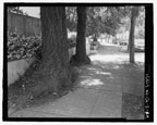
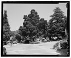
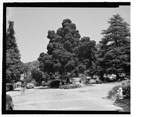
  Moving the camera back and to the right would provide some separation between the tree on left and tree on median. Would also allow a bit more view down street to left. Still a nice view as is.
No. 16

Click image to zoom
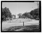
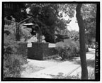
  Nice view of a simple photo and a good example of tricky camera placement. The first inclination may be to move back a bit to include all of the arrow at left and the pole at right; however, that creates a problem at center where the posts and chains would overlap. So what this photo needs is a wider lens and to move the camera forward so the post in the center foreground is only seen against the street surface and does not intrude into the edge of the median.
No. 17

Click image to zoom
  Nice camera placement. Were you conscious of keeping the house number visible? If so well done. If not, a nice bit of serendipity. Again a wider lens would help here more than moving the camera. Would be nice to see more of the facade of the house and more sidewalk to right.
No. 19

Click image to zoom
  Camera management. A bit of distortion in the building. Camera needs to be level. Include all of the phone pole at left rear. Nice arrangement for posts and chains in photo.
No. 21

Click image to zoom
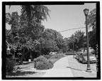
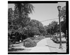
  Camera management -- note how lamp post at left and phone pole at right are leaning. More view of sidewalk on left would be helpful by moving camera back and to right. Include all of phone pole on right.
No. 23

Click image to zoom
  Nice view. I like the way the wall and entrance posts are shown. It would be good to see more of the sidewalk to right; however, it is important to maintain that angle of view on the wall and posts that shows that bit of lawn at left center. A wider lens could have helped. Moving may not have been an option as I can see the camera was near the curb. I would say rotate the camera a tiny bit left to crop the bit of sign post on right.
No. 25 and 25x


Click image to zoom
  Nice. Not sure what the object on right edge is. Signs? I would either rotate camera right a bit to fully include or rotate left and cut out. See cropped version No. 25x without the distraction.
No. 27

Click image to zoom
  Good view. Move camera back a bit to include all of the brick post at right. Lower lens on moving front panel to include more sidewalk and all of base of post.
No. 29

Click image to zoom
  Building distortion. Is there a crossover in the median at left where the fireplug and vegetation are? It would be good to see that if so.
No. 31 and 31x


Click image to zoom
  Very nice. I might move the camera just a bit to the right to show more of the tower then rotate slightly to right to cut some of extraneous space to left and include more street. The white fogging at lower right is from the film holder not being fully seated in the camera -- or perhaps a bad holder. See cropped version No. 31x without flare distraction.
No. 32

Click image to zoom
  Fine!
No. 34

Click image to zoom
  Again fine. I might have rotated a tiny bit left to include more sidewalk, but that's splitting hairs.
No. 40

Click image to zoom
  Rotate camera right a bit -- far left edge is a bit extraneous -- to include tree and sidewalk on right edge.
No. 41

Click image to zoom
  Fine. A bit more space on right and bottom would be good. Looks like there is a grate at bottom right which would be good to include -- but recognize you are practically in street so safety is the operable word and you do the best with the situation.
No. 42 and 42x


Click image to zoom
  A very nice view that needs a simple correction of rotating the camera to right. Eliminate the lamp at left edge; show all of car to right and more of street. The lamp and bit of foliage at top left are visual distractions. Look at the cropped version in No. 42x and you will notice how the view is immediately more focused down the sidewalk.


HOME | ABOUT US | FAQ | LANDSCAPES | MEETINGS | LINKS | GRANTS | CONTACT US
© HALS Northern California Chapter 2012